TEI: Manually Automated

Few scholars who truly consider themselves to “Digital Humanists” will disagree with the following statement: A major goal of Digital Humanities is to enable technology to analyze literature the same way as a human does.” After all, if such a condition were to be satisfied, then the work that literary scholars do over the course of a few days of reading books would be doable infinitely faster. As opposed to analyzing a few texts per week or month, a computer could theoretically do the same amount of work in a fraction of a second – that is – assuming that a computer can arrive at conclusions of the same breadth and insight as a Ph.D. in English Literature (which I believe to, with time of course, be true).

The Text Encoding Initiative

TEI, or the Text Encoding Initiative is advertised as a set of “guidelines for the encoding of humanities texts.” Based on XML and HTML, TEI is an extensive library of categories and tags with which an encoder can markup a text. The tools can be customized but most are standardized and centered around denoting syntax, punctuation, key characters, and places within a piece of text. It’s quite prevalent in the Digital Humanities community but its ends don’t seem to justify its means. While Digital Humanities should be about efficiency, speed, and using technology to save time, encoding a text using TEI is a lengthy and manual process. The learning curve is quite steep, and the fruit of one’s encoding labor is often far removed from the initial effort put in as only advanced programs written by seasoned developers can get at the TEI data.

Example of a chunk of text with TEI markup in it.

Although it makes sense that a system be put in place mark a text up, TEI is simply too involving to be worthwhile. It’s designed to help a computer do close reading of a a story, but it itself requires close reading to be added to a work. Instead, Digital Humanists should be looking into new algorithms to automate the encoding as well as the text mining process. This way, the initial problem of making sense of the insurmountably vast corpus of written material that Digital Humanities sets out to solve can stay on a detour-free route towards its goal.



3D and Virtual Reality: A Mobile Future

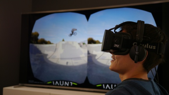
Like it or not, both 3D and Virtual Reality are here to stay. Tech ranging drastically in size and focus are embracing the next generation of immersive experience products such as Oculus VR (acquired by Facebook in March of 2014), Jaunt VR, Google Project Tango, and Matterport.

Man wearing an Oculus Rift virtual reality headset that's displaying footage shot on a Jaunt VR camera system.

Man wearing an Oculus Rift virtual reality headset displaying 360 degree footage shot on a Jaunt VR camera system.

Whereas Oculus and Jaunt seem to be concerned with solely the capture and displaying of immersive 360-degree footage however, Google and Matterport’s technology focuses less on what light hits its lens, and more on the loads of spatial data their products’ sensors gather. Both Google and Matterport are working to automate the tedious task of digitizing our physical word.

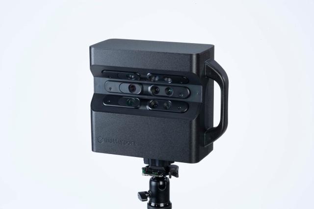
Matterport-3D-Camera1

The Matterport camera atop a tripod

Matterport’s software and hardware development team together since 2011 now has a fully functional camera for sale that uses an iPad-only application for controlling. The form of the Matterport is bulky and awkward, but it shouldn’t be compared to a typical DSLR camera. Instead of just one lens protruding from a sensor within a body, the Matterport has 15 (based on images) parts that are required to be facing the camera’s environment to work. Additionally, there is significantly more on-board data processing that has to go on within the Matterport than on a typical camera so naturally, it will take up more space. Matterport’s frontier technology isn’t cheap either. The camera is $4500 and there are other monthly fees involved for cloud-based data storage and processing.

To generate a 3D .obj file from the physical space around it, the Matterport gets set in a position in a room, and instructed to begin a scan via the connected iPad. The camera then makes a 360-degree spin on its tripod in about a minute then will start processing what it saw in the cloud. Once the data handling from the scan is complete, the iPad will display which parts of the environment were well captured and which were not (due to obstructions such as furniture or distance from the camera) letting the user know where to place the camera for the next scan. Depending on the complexity, size and number of obstructions within the area being modeled, the number of scans required to be done will vary.

While Matterport’s system has produced some impressive sample results as seen on their website they’re up against the big guns: Google is too exploring this type of digital mapping. Matterport’s behemoth Mountain View counterpart is thinking much smaller though. Declassified in February of 2014, Google showed off that it has been working on a similar concept to Matterport, but ported to a mobile device and coined ‘Project Tango.’ Currently distributing their first few hundred prototype Android devices to developers and researchers around the world, Project Tango does seem significantly more promising than Matterport. Even though Matterport’s gear is readily available whereas Google’s is still in the prototyping phase, it’s certainly evident that the future of just about all tech is mobile. Thus Tango is a handheld device unlike the tripod-bound Matterport.

OLYMPUS DIGITAL CAMERA

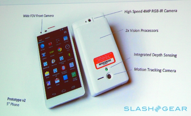
A hardware overview of Google’s Project Tango (via: Slashgear)

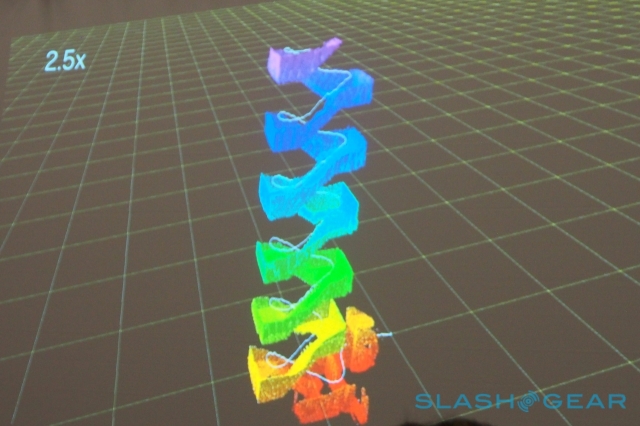
Due to Tango’s clear mobility, X, Y, and Z-axis information dealing with position and rotation has to be gathered. When mapping, Google says its device is capturing over 250,000 points of data per second from the devices three cameras and multiple interior sensors. Even though the current Project Tango’s has its “rough edges,” Google is likely making the product on a small device so once those rough edges are smoothed over, any Android device with the right sensors inside can run Tango software.

OLYMPUS DIGITAL CAMERA

A visualization of the data Tango brings in while mapping a staircase. (via: Slashgear)

Given the rate at which devices are shrinking and how mobile is starting to dominate all of tech, it would seem as though Project Tango is on the better track. Even though they don’t yet have much to show for with their efforts, Google’s focus on something handheld from a user standpoint makes all the sense in the world. Regardless of how digital mapping of 3D environments gets done, its potential use in art, history, real estate, social media, gaming and a plethora of other areas is not going anywhere.

Voyant Tools and Visuwords: Undermined by Poor Interfaces

Unfortunately, not all developers have had the same moment of clarity that tells them that the tools they develop are only as good as the interfaces beneath which their software sits. For web-based and text-mining platform Voyant Tools as well as word-relation viewer Visuwords, such is the case. For Visuwords, at least there appears to be a valid excuse. It was developed in either 2005 or 2006 at Princeton and appears to have just sat on the web ever since. Resultantly, one can’t expect a beautiful front end to such a site as ten years ago the web was a much different place. All things considered, Visuwords is actually a pretty marvelous piece of software. Voyant Tools (although still in beta) on the other hand is a product of the past two years and same for it thus cannot be said. Voyant Tools’ welcoming and simple home page gives the online toolset a promising starting point. It instructs the user to import a chunk of text into the application from any number of sources (be it local or about the internet) before hitting the ‘reveal’ button. Upon ‘reveal,’ numerous visually compelling graphs and tables based on the text you input appear in your Voyant Tools workspace. It’s all downhill from here for Voyant Tools however.

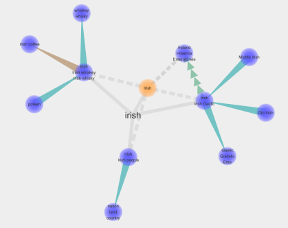
Self described as an “online graphical dictionary,” Visuwords, with its flat and childish Flash graphics, simply takes in a word and shows you other words similar to it. After testing a few items of varying type including pronouns, proper nouns, verbs, and adjectives my understanding of the software is that it really just seems to find around it from an encyclopedia database and display that. The fun animation while your Visuwords is being created coupled with the bouncy and interactive physics of the finished product seem to comprise the majority of Visuwords’ worth. Given how old the software is however, it’s certainly impressive. Alternatives such as Visual Thesaurus  (which used to be built into thesaurus.com’s I believe) have much cleaner and less distracting interfaces that, although may only land one at a synonym and not a description, are still much better tools.

Impressive when all things are considered, and the different line types denote different types of relations between words, but "Irish" connects to "Irish" again which eventually connects to "Whiskey Whisky" one has to question the value of a tool.

Impressive when all things are considered, and the different line types denote different types of relations between words, but when “Irish” connects to “Irish” again which eventually connects to “Whiskey Whisky,” one must question the value of a tool.

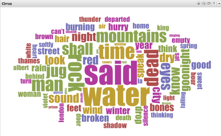
As for Voyant Tools, the user really has to work (and by this I mean guess) to get anything useful out. The cornerstone of Voyant tools is the ‘Cirrus’ cloud visualizer which is of absolutely no use until one either digs deep into the manual of the software (who reads manuals anymore?) or spends the better part of 20 minutes finagling with the buttons around the ‘Cirrus’ to enable the ‘Stop Words.’ This should be much clearer or automated in my opinion as there’s nothing useful to anyone about knowing that “the” and “and” are the most commonly occurring words in the story they’re researching. Voyant tools has a number of other compelling looking tools in their library but getting them to display as you wish is another guessing game.

The 'cirrus' cloud visualizer is at the cornerstone of Voyant Tools.

The ‘cirrus’ cloud visualizer is at the cornerstone of Voyant Tools. Here it’s showing all of  T.S. Eliot’s Wasteland where the larger font denotes greater prevalence in the text.

Visuword’s form over function and Voyant Tools’ ridiculously confusing interface both go to show that design can make or break a piece of software. Especially with Voyant Tools, where the user can just feel that they’re working above some impressive software, but can’t quite crack the code to be able to utilize it to even a fraction of its full potential.

3D Printing: MakerBot on Newbury Street

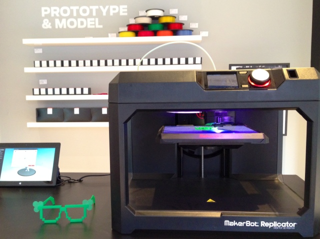
Although still in its infancy, 3D printing is a promising frontier technology that very well could find its way into the common household setting before long. At its core, 3D printing technology differs little from traditional printing. Roughly similar in size to a its traditional paper and ink counterpart, 3D printers also have a nozzle that dispenses its raw material about a plane. Instead of just 2 axises of travel however, the 3D printer is given the ability to move vertically while generating something. Additionally, instead of ink cartridges, 3D printers can use a variety of different materials to produce a product although plastic is most common. Industry leader MakerBot is getting a head start on the competition having opened three retail stores to show off their impressive printers and scanners. Boston’s Newbury Street houses one of these store which opened its doors in November of 2013.

    Tablet holds the 3D CAD file then sends it to the MakerBot Replicator for printing.

Tablet holds the 3D CAD file then sends it to the MakerBot Replicator for printing.

In addition to just printers, the MakerBot retail store teased a laser scanner that spins a model at tiny intervals to generate a 3D model of it. From here, a 3D file such as an .obj can be sent to the MakerBot for printing. If the $949 MakerBot Digitizer isn’t for you however, other alternatives for generating a 3D model exist. Autodesk’s 123D Catch for instance can export files compatible with the Replicator. Also, the manual approach t0 3D modeling using programs like Autodesk 3DS Max will always be the most precise way to make a 3D model. MakerBot can thus be seen as taking the ‘heavy-lifting’ out of modeling and prototyping. Their tools automate a process that used to be carried out by skilled professionals sitting in front of a computer for hours on end. For now, it seems as though MakerBot’s products are ideal for the budding entrepreneur trying to perfect their product design quickly and for cheap. Being able to make adjustments to a design in a computer then have a physical model of in hand within minutes is quite remarkable.

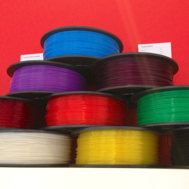
The printers use plastic "filament" as opposed to ink. 1kg of filament is around $50.

The printers use plastic “filament” as opposed to ink. 1kg of filament is around $50.

More at MakerBot’s website.

Autodesk 123D Catch for iOS

For nearly a decade now, Autodesk has remained at the cutting edge of 3D, animation, motion graphics, and video editing software. Known for their incredibly powerful programs that hide behind infinitely less menacing and intuitive interfaces, Autodesk’s iOS application 123D Catch seems quite lacking. Although making software for the casual iPhone or iPad user who wants to play around with a 3D model of their shoe is not (and seemingly never will be) Autodesk’s forte, 123D Catch still could have been much better in many ways. On application launch, there are no directions for the user to know where to begin their first “Capture.” After some toil, the camera screen appears and the application begins to shine. Each iPhone and iPad that is compatible with Autodesk’s free application has two sensors vital to generating the scalable and interactive 3D model 123D Catch promises to generate using only the device’s camera: A 3-Axis Gyroscopic sensor, and an Accelerometer. The gyro outputs data to the application that classifies where each image on a 3D plane was taken from, and at what angle the camera’s lens was facing. The accelerometer isn’t quite as crucial, but it is more sensitive to quick movements made by the device to ensure that before each picture is snapped, the camera is steady and the resulting capture won’t be blurry.

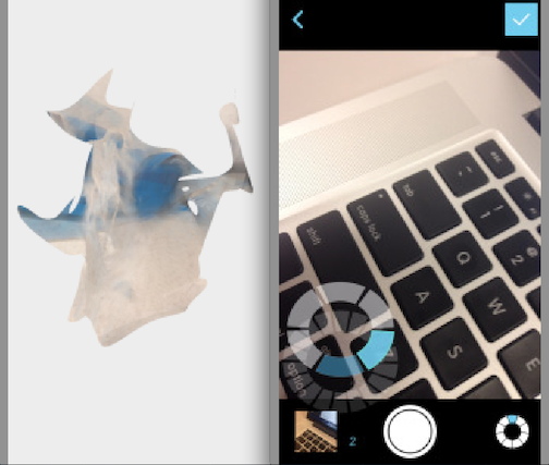
Although the model often comes out looking like a blob, 123D’s Camera interface shows the spatial alignment of each image during capture.

Although the model often comes out looking like a blob, 123D’s Camera interface shows the spatial alignment of each image during capture.

After directing the user to snap anywhere from 10-40 images from various angles and heights of whatever it is they want to make a 3D model, 123D Catch disappoints once again. Before being able to play with their model, the user is forced to making an Autodesk account with their email address and all.  After feeling as though they have invested too much time into their model, the user reluctantly obliges and joins Autodesk’s database. But then, instead of being able to view their model, the app uploads each of the user’s pictures to Autodesk’s servers where the model is to generated. This is not a quick process however. Although there will be variation in time depending on server traffic and complexity of the object, it isn’t until around 30 minutes after upload that the model is ready to be used.  Even then, there no guarantee  that the model will be accurate. Although the scaling and zooming is smooth and simple, it is worthless when the model you wanted comes out as a blob. Strong lighting and plain backgrounds help the app tremendously.

The World is your Oyster: Harvard WorldMap

Nowadays, we have innumerable tools to help digitize and organize whatever bits of data we have. With radically different user interfaces and designs, the purposes for which we use different software varies as well. For instance in Microsoft Word, a clean blank sheet becomes your landscape for data entry that eventually produces a customizable and polished document. In Excel, a spreadsheet laden with cells is where you compile information often useful in tracking finances. For the Harvard-fostered program WorldMap however, the world quite literally becomes your oyster.

Fundamentally, WorldMap differs little from applications like Word and Excel. When dumbed down to its core, WordMap is too just a place to input one’s data so that it’s both digitized and more comprehensive. As opposed to typing up text onto an empty document however, WorldMap grants its users access to Google Maps’ database so their information can be organized spatially.

Upon building their own map, the user finds has vast number of tools with which they can layer, pinpoint, and waypoint a single location, or a number of them. Having the freedom to build your own map is a key feature in WorldMap’s repertoire, but the open source aspects to the program allow it to truly shine. Any map that another user has generated is available for the world to view and interact with. This means that large teams can collaborate on a mapping effort of O.J. Simpson’s infamous police chase or of a piece of literature reliant on geographic context such as James Joyce’s Dubliners for instance. Additionally, WorldMap has a feature called WARP in which a user can overlay any map over a current one. This can be real insightful when comparing methods of cartography or urban development over time. Below is a WorldMap WARP example using an 1885 Frederick Law Olmsted of the Back Bay Fens overlaid with Google Maps at varying transparencies. WorldMap is thus an extremely powerful learning and analysis tool that seems woefully underused.

url

Google Ngram Viewer


For those who can’t quite grasp, or have simply never pondered the processes that Google carries out, check these photos out. The images here take a look at just one of Google’s dozens of data centers scattered across the globe. Among the numerous abilities the data giant reserves thanks to these stacks of servers is a fully digital library of over 30 million books. Contained within the millions of books are billions of words that no individual could ever fathom to read closely even a small fraction of. Fortunately, Google engineers don’t just sit on their vast stores of data – they make impressive use of it.

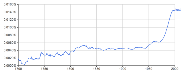
Nearly four years old now, Google’s Ngram viewer has given its users the ability to take advantage of the inconceivable amount of text the company houses in its data centers. Although basic (at its inception) from an algorithmic perspective, the software platform’s power derives from the sheer size of the library it draws from. To conduct a search on Ngram, the user inputs a series of comma separated terms and date constraints (from as early as 1500-present). From there, Ngrams will print a line graph displaying your terms’ relative frequency in all of Google’s printed material database over time. This tool thus gives its users the ability to plot the evolution of words and see how new (or old)  some phrases are. At its core, Ngram Viewer is nothing more complex than a search tool and calculator – one that just so happens to be tied into the largest digital database of books.

Just the word 'text' overtime to show the Ngram interface

Just the word ‘text’ overtime to show the Ngram interface

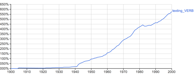
Just recently though, Google upped the ante with its Ngram analytics tool. Now, instead of just being able to see a word’s prevalence over time, the search allows the user to see a word evolve in a specific part-of-speech. Calling upon a heftier sum of back-end  coding to being able read and utilize contextual information, Google’s Ngram Viewer now allows users to visualize a trend such as the word ‘text”s shift from noun to verb. As Digital Humanities expert Matthew Jockers would argue, literary big data and the information we can derive from it certainly has a ton of potential ahead of it. Google’s Ngram Viewer is however an very impressive start.

No surprises here...

No surprises here…


Take Note: Cloud vs. Paper

I feel it’s worth noting that historically, I have never been too keen on taking notes. Be it in a classroom setting, or a more personal space, I have typically relied on my frontal-lobe and the occasional post-it to keep my thoughts organized. Just this past Christmas, however, things changed. My Grandmother got me a beautiful leather-bound journal – the edge of each page gilded in gold paint. For the past month or so, I have found that having this journal with me and contributing to its contents on a daily basis has been great for me both creatively and therapeutically.

Enter Evernote.

Although I’ve known about Evernote since its earlier years (it was founded in 2008), I first downloaded their Mac and iOS Applications about two weeks back. It felt awkward doing so – was I already cheating on my new love, the leather journal? After these two few weeks of use however, I have found that my physical journal and my cloud-based helper can have markedly different uses. Whereas my physical journal remained a place for me to reflect and expand on my deeper, more intriguing ideas, Evernote became the ideal place to store more trivial thoughts. For example, a reminder to get to a meeting with a professor in office hours in the next week, or storing a picture of a flyer for a speech I may enjoy would call upon Evernote. It’s user interface is clean, and in just one tap after launching the iOS application, I can begin typing my thoughts or storing an image. Additionally, the latest update to the mobile app that was released this morning (1/31/14) allows the user to take a picture of a business card and have the app’s algorithms digitize the text. Clearly there is space for both a physical notepad, and a digital personal assistant in my life.

    convenience.

Evernote is all about convenience.